How M/M Paris’ New Illustrated Alphabet for Miu Miu Converses with A History of Human Alphabets + “The Real World Around Us”

Row upon row of white, billowing rectangles hang from the ceiling of an airy hall in the Perret building in Paris: each sheet bears an illustration of a female face or body, which splinters elegantly with the bars of a letterform. Read together in this long, dramatic space, the floating texts spell out: “The Miu Miu Type, an ABC of Actions Behaviours and Comportments”. The lights go off. The catwalk begins. The audience is implicitly in dialogue with Miu Miu’s distinctive language of femininity.

Miu Miu Fall/Winter 2018 Womenswear Show installation shot. Design by M/M Paris.
M/M Paris—the design partnership of Mathias Augustyniak and Michael Amzalag—is renowned for its art, music, and fashion collaborations. In fact, the two Ms are the art director go-tos of the fashion world, having worked closely with Jil Sander, Yohji Yamamoto, and Stella McCartney, as well as Miuccia Prada of Prada and Miu Miu. The studio’s most recent installation for Miu Miu’s Fall/ Winter 2018 Womenswear show has drawn on M/M Paris’ history in fashion as well as its rich typographic archive to create a memorable, and playfully metaphorical, female-bodied alphabet. The ABC imagines “characters” that wear Miu Miu, and flirts with how a wardrobe is like a language system, where different combinations of forms spur different kinds of expressions.
In the past, the Prada group has commissioned Rem Koolhaas’ AMO OMA design studio to create holistic sets for its shows—“little worlds” as Amzalag describes them—but Miuccia Prada approached M/M to “challenge” what had become the company’s standard. “What we decided is that we want to get rid of those little worlds,” says Augustyniak. “We wanted to be in dialogue with the real world around us. That’s why we constructed a set of signs. Design, to be successful, needs to create a conversation, instead of placing people in an immersive world. This is one of the differences between architecture and design. We wanted people outside to see what was happening from the window. We posted the alphabet across the streets of Paris. The signs spread beyond the show. It’s a diffusion strategy. It’s about engaging conversation.”


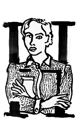
“The Miu Miu Type, An ABC of Actions, Behaviors and Comportments”. Design by M/M Paris, 2018.


Giving language to personality and form to character type are metaphors M/M Paris has played with throughout its history. The duo has developed numerous collections of human alphabets that transform fashion photographs and figures into letterforms, for example “The Alphabet”, “The Alphamen”, “Figures”, ‘Punctuation”, and most recently, “The New Alphabet”. Unlike other human alphabets from the past, like those created by the French art deco artist Erté in the 1920s for fashion magazine, or Anthon Beeke’s 1960s female nude alphabet, M/M Paris’ sets do not bend a woman’s body to create the shape of a letterform. Instead, its sets construct an alphabet around the body, finding ways to integrate various lines from a model (say the shape of an arm or the shadow across a face) into the required character.
With “The Alphabet”, the studio’s first foray into human alphabets designed in 2001 for V Magazine, the M/M duo first took photographs of 26 famous models, one for each letter of the alphabet. They then cut away at these portraits with scissors to create each required letter form, using existing lines and shadows within the photograph as the basis for each character’s shape. Instead of forcing the body to form a letter, it crucially allows the body to form the shape of a letter instead, resulting in jagged, erratic, and idiosyncratic angles determined by the subject.

“The Alphabet”, V Magazine, designed by M/M Paris, 2001.
“It’s different from Erté,” says Augustyniak. “There is a violence when you bend the body, because the body cannot be made into the shape of an A or a B. It’s kind of a lie. Whereas you can say that there is such a thing as a person’s ‘body language,’ and when creating an alphabet, you can show it by allowing a person’s body to determine the shape of a letter. This is the strategy we’re interested in. ”

Erté, the letter E from ‘The Alphabet’, 1927.
M/M’s 2016 ‘The New Alphabet’ for V Magazine took a similar principle, but moved away from the studio’s typical approach of photo collage and cutting. “When you’re using photographs as a base, it’s complicated, and we’ve played a lot with it,” says Augustyniak. Instead, the studio drew illustrated renderings of photographs of the various models. In this set, M is for Julianne Moore for example, O for Yoko Ono, and C for Cate Blanchett. Thick letters encircle or wrap around the illustrated portraits, recalling the intricate, illuminated drop caps of medieval texts. Although the letterforms determine the composition, the models don’t twist to the will of a form, but rather blend with it, seemingly whenever it suits them. See G for Greta Gerwig for example: her kicking leg breaks from the shape of the G entirely, but then her straight torso also completes and compliments the bottom curve of the letter’s body.

“G” from “The New Alphabet”, V Magazine, M/M Paris, 2016.
The Miu Miu type takes the strategy explored in “The New Alphabet” further. “The Miu Miu girl has conviction and belief, her wardrobe is a kind of alphabetical system, which helps her express and define herself within a community,” says M/M Paris. Here, the studio interprets the woman who wears Miu Miu not as dressing herself to become an object of desire, but in order to express her personality. This is why, in the Miu Miu alphabet, letterforms shyly cut through the lines that form the faces or clothing of women. These illustrated women are independent of the letterforms and stand however they like; a character then needs to shape itself to fit that woman’s composition.
In the light, open space of the Perret building in Paris, M/M Paris hung one last sent of characters from the ceiling. As well as the female alphabet, the designers used a series of letterforms pulled from their own archive of typefaces to spell out the title of the show. “When we work, we like to perform,” says Augustyniak. “We had the Miu Miu type, our interpretation of it, and then behind it, the title of our installation, written in our M/M type. It was important that we were part of the show, too. We couldn’t just be the service provider. When Miuccia invited us to do the commission, it was a provocation; an invitation for M/M to converse with Miu Miu.”

Miu Miu Fall/Winter 2018 Womenswear Show installation shot. Design by M/M Paris.
Fida Membership Program
-
Mentorship Programme
Regular price From £349.00 GBPRegular priceUnit price per -
FULL ACCESS – Project Membership
Regular price From £295.00 GBPRegular priceUnit price per -
Mini Membership
Regular price From £89.00 GBPRegular priceUnit price per -
Student Project Membership
Regular price From £129.00 GBPRegular priceUnit price per